A2 Media Coursework
Wednesday, 13 April 2011
Evaluation: How did you use media technologies in the construction and research, planning and evaluation stages?
 whole making of my coursework I used an Internet site called Blogger to present my work upon. This has been a huge advantage for both my teachers and I because it has allowed easy access, anywhere and anytime to my coursework making my coursework inputs flexible in addition to my lessons. My teachers have been able to view my work and keep track of what I have been posting and my peers have been able to access each other's Blogs for help and guidance. The element of feedback can be gained as people can comment your posts and give criticisms and positive guidance.
 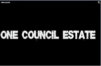 ogramme allowed us to finely edit our footage, add sound tracks, add transactions and titles- this enabled us to sort through the best suited and quality footage and add elements such as titles (as seen on the left) to further elaborate what my partner and I are trying to represent. When producing our film poster we used a programme called 'Photo Shop' which allowed my partner and I to first fix the image we was going to make into a film poster, by increasing the quality of the image, colour boosting and adding a higher contrast to make the image more eye catching. After this we were able to add word art on to the image to make it more believable as a film poster. We used the Internet to research images on 'Google Images' of existing film posters to grasp an idea on how to present our own poster. The accessibility of the Internet helped gain relevant ideas such as including a quote from the magazine company, 'Empire'- this was something that was not previously considered and without the Internet we would not have included this feature. On the other hand, the construction of the magazine cover was processed on the Microsoft programme 'Publisher' this application gave a wide range of features that we used in the process of creation. For example, various types of font and colour were available to be incorporated on to our magazine cover which made it more interesting as a product because audience would be drawn in to reading it- increasing popularity to the media products.
The planning stages of the film trailer consisted of the creation of:
- Mind maps- these were created on 'Microsoft Word' allowing arrows and texts boxes to express our ideas.
- Shooting scripts- these were made on 'Microsoft Word' an existing template was used, in order to input dates and procedures for those days, making it easier in the production process.
- Scripts- also formed on 'Microsoft Word' fonts on this programme allowed the script to look realistic.
- Call sheets- again processed on 'Microsoft Word' an existing template consisting of named text boxes allowed instructions to be made about filming.
- Shot lists- a simple list was formed in chronological order upon the programme 'Microsoft Word'.
- Location shots- occupied by the Internet function of 'Google Maps' access to the street view gave images to potential areas we could film and directions on how to get there.
- Props list- established on 'Microsoft Word' images were found on 'Google Images' to make the piece more presentable and eye catching.
- Cast list- this was directly inputted to 'Blogger' images were gained using a digital camera to let the audience know who the cast were.
- Job roles- directly posted on 'Blogger' and the images were again captured on a digital camera so the audience is aware on who produced the film trailer.
- Story board- an existing template on 'Microsoft Word' allowed easier creation and cut down time wasting. We in ported images from print screens of existing footage we had and may have used in our final cut.
The planning for both our film poster and magazine cover differed slightly. Although we do use the Internet to gain existing images of these two media products through 'Google Images' this allowed ideas to be developed and later portrayed in our work. The planning was directly uploaded on to our blog and consisted of images gained from a photo shoot using a digital camera. These images signified potential magazine and film poster covers and through the use of a blogger we were able to upload them on to a post and write about their strengths, weaknesses and their suitability factor. When my partner and I decided on a idea for both ancillary task we stretched up an abbreviation to interpret what we expected from the final outcome, I then scanned this sketch so that it could be finally uploaded. Choosing the programme for both tasks was easily done, as the film poster image needed to be edited so this function was found in 'Photo Shop'; whereas the applications found in 'Microsoft Publisher' were more suited to the magazine cover.
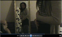
The evaluation of our final product consisted of looking back over my existing 'Blogger' using the access of the Internet to analyse the posts to answer each question. An element I found easy to explain comparisons was an Internet formatting programme called, 'Slide Share' this enabled 'Microsoft PowerPoint Presentations' to be uploaded on to 'Blogger'- giving more interactive method to explaining and evaluating my work. I also, print screened and imported still images from my film trailer were used to explain areas of my film- this gave a more visual understanding. Below is an example of a print screened picture, in this I would explain that the character is susipicous of being pregnant and the shot of her looking in the mirror signifies her questionable identidy.  I also created questionnaires, conducted interviews and recorded feedback to gain ideas about what the target audience thought about my media products.
Evaluation: What have you learnt from your audience feedback?
 From the questionnaire results I found that the majority of the audience enjoyed our film and thought it was a successful representation of a social realism film. Many commented that it was a film they would be interested in watching, as the themes found within the film was something they recognised and familiarised with. However, some criticisms were made known, for example two candidate commented on how they thought that the opening location shots were too long and felt this abolished the tension rather than building it. Also, one candidate noted that the shots shown at the beginning of the trailer were slightly shaky and did not portray the effect that we were hoping for. Another candidate expressed how they were confused about what was happen in the trailer as no clear storyline was shown, yet just the themes were pictured. Through this criticism we are now aware as a group as to where we could have improved, elaborated and developed. The film poster and magazine cover also had positive reactions, the most praised media product my partner and I created was the film poster. Audiences believed it was a realistic imitation of a film poster which expressed the idea of a troubled gang of girls with lost ambitions. This is an example of one audience's feedback we gained through a recording:
Tuesday, 12 April 2011
Evaluation: How effective is the cobination of your main product and ancillary tasks?
 Above, magazine cover.
Nevertheless, there are reasons as to why we have not used this synergy within the creation of our magazine cover. The most valuable reason is that we wanted to show the actresses in their natural light, expressing their normality and stardom before their actual role. I believe that this approach not only promotes the film, but with this promotes the credibility of the actresses and gives the film an extra promotion lead as with increased popularity of the actresses comes increase popularity of the film.
The existence of synergy use within our media productions can be viewed from the slideshow below.
Monday, 11 April 2011
Evaluation: In what ways does your media product use, develop or challenge forms and conventions of real media products?
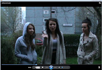 are of what they are consuming. The conventions we have used are: gang culture (as seen on the left), violence, weaponry and controversy i.e. underage pregnancy and attempted suicide. By only including the themes within our trailer and giving a slight insight to what would be featured within the film, this has ensured that we haven't given too much of the story away. By revealing too much of the story can spoil the audience's viewing because through watching the trailer they feel they already sure of what would happen- this would decrease the chance of them watching the film as they feel they have seen too much of the storyline. Through the analysis of Adulthood, there was a dinstinct use of titles which broke up the imagery and told the audience messages about the film. I used this idea when editng my own product, the use of titles, such, 'One Council Estate' gave a clear definition as what my partner and I were trying to capture and portray.
 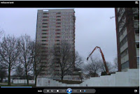 nsion rose to a climax when it began to quicken- this gave a more captivating reaction as the audience were more inquisitive and excited as to what was happening. The start of the trailer draws the audience in by displaying location shots (as seen on the left) with the intense grime music gives an edgy feel, after this follows the themes found in the trailer and more dialogue is heard- this makes the audience recognise that the characters are involved in gang culture, use a restricted code of language and live in a dreamy reality as they are unsure as to what life can actually give them. I do not feel the audience would speculate the genre of the film as the conventions are easily identifiable, the target audience should be familiar with the conventions represented as they are seen in everyday life in some deprived areas of the UK.
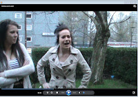 st, some aspects of trailer have subverted stereotypes as typically gang culture is male dominated; however within my trailer the gang only consists of females. I have also subverted the stereotyped traits of females, typically they are seen as caring, kind and timid; my female characters foster more male traits i.e. strong, independent, boisterous and rebellious. This is an area I feel strongly about as women are time and time again portray in a less independent way and are seen as more reliant on males; this is not the case in today's society, although not all woman are part of sub-culture and drawn to these conventions (e.g. crime) women are now independent and strong minded. Occupying more respect within the home and the workforce women have gained more respect in all areas of life and this is something that should be represented in film. Although our film trailer captures a more extreme view of women they are still portrayed in a stronger way.
 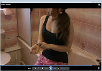 character crying?' or 'Who committed the murder?'- Using this as a reference I have mirrored this in my own production as within my trailer I have imposed questions such as 'Why are the characters disrespectful?' or 'Why is she self-harming?' The drastic scenes such as the attempted suicide pose questions and conspiracy from the audience because they are unsure of the full story. The element of mystery sprouts from the storyline of attempted suicide, this makes the audience feel edgy as to what might happen and also does not give the storyline away from the way we have filmed it. I took into consideration how the camera angles could portray a meaning, for example in the shot to the left you can only see part of the character this shows mystery towards what will happen and reflects her insecurity. The centred picture is of the scissors which portrays the seriousness of the situation and what it may entail. Through the mise en scene, costume and body language represents how child like the character is within this serious situation, for example her costume is teddy bear patterened night wear which allows the audience to be aware that the character is young and naive; this suggests that she is vunerable and may make mistakes when making decisions and create further anxiety to what may happen to this character.