Wednesday, 13 April 2011
Evaluation: How did you use media technologies in the construction and research, planning and evaluation stages?
 whole making of my coursework I used an Internet site called Blogger to present my work upon. This has been a huge advantage for both my teachers and I because it has allowed easy access, anywhere and anytime to my coursework making my coursework inputs flexible in addition to my lessons. My teachers have been able to view my work and keep track of what I have been posting and my peers have been able to access each other's Blogs for help and guidance. The element of feedback can be gained as people can comment your posts and give criticisms and positive guidance.
 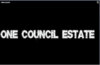 ogramme allowed us to finely edit our footage, add sound tracks, add transactions and titles- this enabled us to sort through the best suited and quality footage and add elements such as titles (as seen on the left) to further elaborate what my partner and I are trying to represent. When producing our film poster we used a programme called 'Photo Shop' which allowed my partner and I to first fix the image we was going to make into a film poster, by increasing the quality of the image, colour boosting and adding a higher contrast to make the image more eye catching. After this we were able to add word art on to the image to make it more believable as a film poster. We used the Internet to research images on 'Google Images' of existing film posters to grasp an idea on how to present our own poster. The accessibility of the Internet helped gain relevant ideas such as including a quote from the magazine company, 'Empire'- this was something that was not previously considered and without the Internet we would not have included this feature. On the other hand, the construction of the magazine cover was processed on the Microsoft programme 'Publisher' this application gave a wide range of features that we used in the process of creation. For example, various types of font and colour were available to be incorporated on to our magazine cover which made it more interesting as a product because audience would be drawn in to reading it- increasing popularity to the media products.
The planning stages of the film trailer consisted of the creation of:
- Mind maps- these were created on 'Microsoft Word' allowing arrows and texts boxes to express our ideas.
- Shooting scripts- these were made on 'Microsoft Word' an existing template was used, in order to input dates and procedures for those days, making it easier in the production process.
- Scripts- also formed on 'Microsoft Word' fonts on this programme allowed the script to look realistic.
- Call sheets- again processed on 'Microsoft Word' an existing template consisting of named text boxes allowed instructions to be made about filming.
- Shot lists- a simple list was formed in chronological order upon the programme 'Microsoft Word'.
- Location shots- occupied by the Internet function of 'Google Maps' access to the street view gave images to potential areas we could film and directions on how to get there.
- Props list- established on 'Microsoft Word' images were found on 'Google Images' to make the piece more presentable and eye catching.
- Cast list- this was directly inputted to 'Blogger' images were gained using a digital camera to let the audience know who the cast were.
- Job roles- directly posted on 'Blogger' and the images were again captured on a digital camera so the audience is aware on who produced the film trailer.
- Story board- an existing template on 'Microsoft Word' allowed easier creation and cut down time wasting. We in ported images from print screens of existing footage we had and may have used in our final cut.
The planning for both our film poster and magazine cover differed slightly. Although we do use the Internet to gain existing images of these two media products through 'Google Images' this allowed ideas to be developed and later portrayed in our work. The planning was directly uploaded on to our blog and consisted of images gained from a photo shoot using a digital camera. These images signified potential magazine and film poster covers and through the use of a blogger we were able to upload them on to a post and write about their strengths, weaknesses and their suitability factor. When my partner and I decided on a idea for both ancillary task we stretched up an abbreviation to interpret what we expected from the final outcome, I then scanned this sketch so that it could be finally uploaded. Choosing the programme for both tasks was easily done, as the film poster image needed to be edited so this function was found in 'Photo Shop'; whereas the applications found in 'Microsoft Publisher' were more suited to the magazine cover.
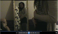
The evaluation of our final product consisted of looking back over my existing 'Blogger' using the access of the Internet to analyse the posts to answer each question. An element I found easy to explain comparisons was an Internet formatting programme called, 'Slide Share' this enabled 'Microsoft PowerPoint Presentations' to be uploaded on to 'Blogger'- giving more interactive method to explaining and evaluating my work. I also, print screened and imported still images from my film trailer were used to explain areas of my film- this gave a more visual understanding. Below is an example of a print screened picture, in this I would explain that the character is susipicous of being pregnant and the shot of her looking in the mirror signifies her questionable identidy.  I also created questionnaires, conducted interviews and recorded feedback to gain ideas about what the target audience thought about my media products.
Evaluation: What have you learnt from your audience feedback?
 From the questionnaire results I found that the majority of the audience enjoyed our film and thought it was a successful representation of a social realism film. Many commented that it was a film they would be interested in watching, as the themes found within the film was something they recognised and familiarised with. However, some criticisms were made known, for example two candidate commented on how they thought that the opening location shots were too long and felt this abolished the tension rather than building it. Also, one candidate noted that the shots shown at the beginning of the trailer were slightly shaky and did not portray the effect that we were hoping for. Another candidate expressed how they were confused about what was happen in the trailer as no clear storyline was shown, yet just the themes were pictured. Through this criticism we are now aware as a group as to where we could have improved, elaborated and developed. The film poster and magazine cover also had positive reactions, the most praised media product my partner and I created was the film poster. Audiences believed it was a realistic imitation of a film poster which expressed the idea of a troubled gang of girls with lost ambitions. This is an example of one audience's feedback we gained through a recording:
Tuesday, 12 April 2011
Evaluation: How effective is the cobination of your main product and ancillary tasks?
 Above, magazine cover.
Nevertheless, there are reasons as to why we have not used this synergy within the creation of our magazine cover. The most valuable reason is that we wanted to show the actresses in their natural light, expressing their normality and stardom before their actual role. I believe that this approach not only promotes the film, but with this promotes the credibility of the actresses and gives the film an extra promotion lead as with increased popularity of the actresses comes increase popularity of the film.
The existence of synergy use within our media productions can be viewed from the slideshow below.
Monday, 11 April 2011
Evaluation: In what ways does your media product use, develop or challenge forms and conventions of real media products?
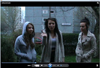 are of what they are consuming. The conventions we have used are: gang culture (as seen on the left), violence, weaponry and controversy i.e. underage pregnancy and attempted suicide. By only including the themes within our trailer and giving a slight insight to what would be featured within the film, this has ensured that we haven't given too much of the story away. By revealing too much of the story can spoil the audience's viewing because through watching the trailer they feel they already sure of what would happen- this would decrease the chance of them watching the film as they feel they have seen too much of the storyline. Through the analysis of Adulthood, there was a dinstinct use of titles which broke up the imagery and told the audience messages about the film. I used this idea when editng my own product, the use of titles, such, 'One Council Estate' gave a clear definition as what my partner and I were trying to capture and portray.
 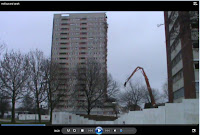 nsion rose to a climax when it began to quicken- this gave a more captivating reaction as the audience were more inquisitive and excited as to what was happening. The start of the trailer draws the audience in by displaying location shots (as seen on the left) with the intense grime music gives an edgy feel, after this follows the themes found in the trailer and more dialogue is heard- this makes the audience recognise that the characters are involved in gang culture, use a restricted code of language and live in a dreamy reality as they are unsure as to what life can actually give them. I do not feel the audience would speculate the genre of the film as the conventions are easily identifiable, the target audience should be familiar with the conventions represented as they are seen in everyday life in some deprived areas of the UK.
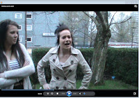 st, some aspects of trailer have subverted stereotypes as typically gang culture is male dominated; however within my trailer the gang only consists of females. I have also subverted the stereotyped traits of females, typically they are seen as caring, kind and timid; my female characters foster more male traits i.e. strong, independent, boisterous and rebellious. This is an area I feel strongly about as women are time and time again portray in a less independent way and are seen as more reliant on males; this is not the case in today's society, although not all woman are part of sub-culture and drawn to these conventions (e.g. crime) women are now independent and strong minded. Occupying more respect within the home and the workforce women have gained more respect in all areas of life and this is something that should be represented in film. Although our film trailer captures a more extreme view of women they are still portrayed in a stronger way.
 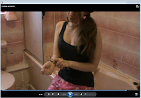 character crying?' or 'Who committed the murder?'- Using this as a reference I have mirrored this in my own production as within my trailer I have imposed questions such as 'Why are the characters disrespectful?' or 'Why is she self-harming?' The drastic scenes such as the attempted suicide pose questions and conspiracy from the audience because they are unsure of the full story. The element of mystery sprouts from the storyline of attempted suicide, this makes the audience feel edgy as to what might happen and also does not give the storyline away from the way we have filmed it. I took into consideration how the camera angles could portray a meaning, for example in the shot to the left you can only see part of the character this shows mystery towards what will happen and reflects her insecurity. The centred picture is of the scissors which portrays the seriousness of the situation and what it may entail. Through the mise en scene, costume and body language represents how child like the character is within this serious situation, for example her costume is teddy bear patterened night wear which allows the audience to be aware that the character is young and naive; this suggests that she is vunerable and may make mistakes when making decisions and create further anxiety to what may happen to this character.
 Thursday, 7 April 2011
Planning: Film Poster- Potential Images
 To the left are samples of our potential images for our film poster. These images were carefully represented in way for the characters to look united and strong- replicing the 'This is England' film poster. I think this photo is not suitable to promote our film because although the title of the film 'B36' is clear to see, the characters are not close together and seem segregated in the photograph and that isnt what we want to portray.
 The second image is suitable for the film poster, and would be relevant for what we want to present i.e. a gang of girls united and lost as t what they want from life, the distant looks represent this.

Planning: Magazine Cover- Potential Images

Planning: Ancillary Tasks


Above, draft of magazine cover.

For the film poster we based our ideas from the previous film poster of 'This is England' which has elements similar to our film poster, for example, the gang of girls are standing in front of a wall just the same the gang found in 'This is England'. We represented this as the ethics of the picture project unity which is something we wanted to portray in our own film poster.
We created the film poster through a programme we have used previous called 'Photo shop' which has many technologies that made our film poster look astonishingly better. These elements include, colour booster, word features and eraser tools. This made the creation process easier as tools were accessible to use to improve our work.
Through research into other existing film posters we found that many use quotes from newspapers, magazines and other medias to help promote the popularity of the film. From this we were able to include a quote for our film to help infuse people to be more interested in watching the film. We decided to use the quote: 'Emotion and epic- not one to be missed!- Empire' this gave more depth to the films connotation as it shows that is a meaningful storyline of a harsh reality, and by using a popular magazines name boosts the likelihood of an audience being interested in watching the film.
We gathered initial ideas about our film poster from a piece of graffiti found the local areas which expressed the postcode 'B36' so this was how the original name was initiated and how we decided to incorporate the 'This is England' replica through standing in front of the wall with the graffiti on.
Saturday, 2 April 2011
Planning: Cast List & Job Roles
 revious experience in her own media productions. Although she only had one line in the trailer and only two extra scenes to act alone she felt she able to pursue this role confidently. A scene she is acting independently deals with the issue of pregnancy, after talking about the role with Sheryl she felt she could represent this and gave ideas about she could portray it. With this is we were given ultimate faith in both of the girls to help us gain a successful film trailer.
 Melissa Doyle as Mia
Melissa felt she could successfully portray this role adequately due to her previous acting experience, she felt she could build up a gritty attitude that the character Mia has. As the part was only a small role she took on the responsibility of camera work, whereby the parts she was not involved she filmed, and the parts she was involved with I filmed.
Friday, 1 April 2011
Planning: Shooting Scripts
 To the left, is a shooting script. This was created so we are certain on what we are doing each day, what we are filming, what actresses we need, what props we need and what dialogue we need. For example, on the 14th March 2011 we hope to film all location shots around the area, taking note of what camera shot/angles/movements we need to use. Also, we will be filming a scene where all the actors are needed, this scene involves all the characters in a bedroom singing, dancing, smoking and consuming alcohol. We have various other shooting scripts that will give us prefence on what we need to do over a number of days.
Planning: Props List
Planning: Shots List
Planning: Storyboard
Planning: Script

Thursday, 31 March 2011
Primary Research: Questionnaire & Charts
 The first chart (pictured below) diplays the question: 'How do you prefer the background music to be?' The majority vote finalised as parelel. The music we are using is parelel to the story that the trailer prevails, it is a urban/grime track which is the type of music this sub culture stereotypically listens too. With this, the target audience will be familiar with this type of music and may be more enticed to watching it due to this factor.
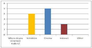
The third chart (pictured below) displays the question: 'What is your favourite genre?' The feedback from this question suggest that the this target audience's favourite genre is comedy; however a close second would be social realism. With my trailer I will aim to convert the target audience to that they favour social realism more. In addition, I have taken this information on board as i hope to include comical diologue into my script to satisfy my target audience.
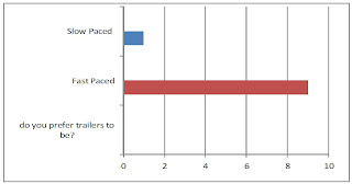
 The final chart (pictured below) displays the question: 'Do you prefer trailers to be fast paced or slow paced?' The results show that the majority preferred fast paced trailers. This is something to considered as the themes within my genre are extreme and deviant having a fast paced edit will add to the excitement. My partner and I have concluded that the editing will begin slow while location shots are shown; however the development of pace will increase as the themes are portrays making it dramatic for the audience.
Target Audience
 However, Frank McConnells theory is based around the idea that instead of basing genres around visual clues, it is more meaningful to split texts according their themes, plots and leading characters. He came up with five genres which specifically refer to typical events in the history of any society and the characters who play parts in them. He believes that since films reflect society, they will always involve these kinds of typical events:
 - The King- establising the state- epic
- The Knight- consolidating the state- ad venturous romance
- The Pawn- trapped in the institutional state- melodrama
- The Fool- responding to the madness of the state- the satire
- Apocalypse- the collapse of the state which leads to a new begining- no single hero.
Considering this perspective our genre would fall under 'The Pawn'. This would mean that we would have to satisfy the audience using themes, plots and leading characters to show that they are trapped in their state. We have tried to create this by creating a gang of females who have suberted stereotypes (boisterious, strong, rebellious), who are trapped by a controlling ideology to rebel against society through deviant behaviour, such as, drug taking, alcohol consumption, crime and anti-social behaviour. Using these themes would thrill the target audience as they would understand that this behaviour is wrong and would be intrigued to discover the outcome of their actions.
Friday, 18 March 2011
Planning: Location
 These are photographs I acquired through 'Google Maps' this function allowed me to access a 'street view' whereby I could view possible places around the area that would be suitable to shoot. I gained these images as to left is the house we will film outside. A character will walk past these houses using a tracking shot. Also a scene will be filmed outside the house where the gang of characters terrorise a resident of the house.
 This image portrays another area we will film; this important shot will exercise the message on the sign, 'Remove your valuables before the thieves do!' This reinforces the deviant behaviour displayed by the characters within the trailer.

This is another potential area we may use in our footage. Either, a location shot or one that consist of the character.
Planning: Film Trailer Ideas
 To initiate and gather ideas about our film trailer we produced a mindmap of ideas. Using different sub titles we were able to suggest certain elements and coventions we wanted to include within a film.
Previously, we conducted research into existing film trailer featuring the social realism genre. This research helped develop our ideas and made it easier to actually put pen to paper.
For example, through watching Adulthood and anaylsing the behaviour they use we able to learn that they often use a restricted code with bad language, we thought this would be a good covention to use within our own film trailer as it shows the type of socialisation and culture that our characters come from, making it easier for the audience to be able to identify with them.
We are also considering not to portray at storyline so obviously; however represent themes often found in the social realism genre, such as, gang culture, violence, promiscuity and drugs. This would also not give too much of the storyline away as this can often spoil it for the audience.
Thursday, 27 January 2011
Case Study: Shaun Of The Dead
The Magazine Cover

Shaun of the Dead is being promoted by Total Film magazine above. The conventions within the magazine cover highlights the genre of the film. The title of the magazine is in red and is bold which reflects the convention of blood within the film- which is iconography often used by the horror genre. The main image denotes the main character 'Shaun' who is a man determined to to get his ex-girlfriend back, redeem his relationship with his mother, while fighting his way to safety through an entire community that have returned from the dead to eat the living.
The magazine cover promotes this story as he is wearing a ripped shirt covered in blood, holding a baseball bat and a bandanna. The denotation of the character is that he has a hungry look in his eyes and is determined to win his losing battle. The magazine image successfully portrays his strive and makes audiences want to discover what his determination is dedicated to.
The background is quite bland which makes 'Shaun' stand out more and become the centred focus of the page, which would in turn make readers want to read about Shaun of the Dead boosting its popularity. The clothes in which he is wearing is his work clothes which shows the difficult time he has had with added element of the amount of blood he has on his uniform. You can easy identify the genre of the film because of the imagery used, it could also be identified that the genre also falls under a comedy because of the description beneath the image.
The description on the magazine is less focused on the film, which doesn't make the film stand out in its excellence as much as the strong imagery does. This can have a negative effect on the influence it has on audiences because it does not praise the film but infuses other features within in the magazine to the audience.
The Film Poster

The denotations of the image shows 'Shaun' holding a bouquet of flowers stuck between a crowd of zombies. This adds further comedy aspects because he conveys a puzzled face, this makes this amusing due to the fact he is surrounded by man-eating zombies; the connotation of this is that the zombies around him symbolise the problems he is dealing with in reality, breaking up with his girlfriend, his relationship with his mother and the hatrid towards his step father.
The connotation of the position of the character shows how he is trapped and isolated in the film because he is feeling lonely after being dumped, and he is isolated because of the zombies. The title of the film 'Shaun of the Dead' has a hand that creates the image of an 'A'; this feature is highlighted and used throughout the promotion of the film and is almost a logo for the film title. When filming our trailer, creating our magazine cover and film poster we could convey this type of promotion by using a key feature throughout to make it representable.
The Trailer
http://www.youtube.com/watch?v=yfDUv3ZjH2k
 The production company is shown at the start of the trailer which is useful to know as they invested the money to create the film and distribute it making them have presence in the promotion. The screen becomes static when a voice over starts, this connotes a sense of confusion within the storyline as the voice over stresses, 'this message is for your own safety'; this makes audiences anxious as to what he is referring to. The fast editing shows a montage of imagery consisting of zombies and the general public. The constant flickering, static and pixalating confuses views and makes them feel on edge as to what is happen in the footage.
A medium shot is shown of the two main characters listening to the voice over with dumb stricken looks up on their faces as they look at one another, the voice over warns 'Do not panic' they act contrapuntal to this as they realise there is a zombie in their home. This connotes a comical element to the trailer as you are already introduced to their character traits as they have stupidly left the front door open. They act panicked in a comical way as they scream 'Oh he's got an arm off!' This amuses viewers as puts light on the harsh reality that they could be eaten any minute. The voice over continues throughout the trailer to give advice to citizens which the characters fail to follow, this behaviour is amusing to audiences as they are not acting correctly to protect their own safety.
The diegetic bac kground music is contrapuntal to what is happening in the scene, it is upbeat and almost child like while the scenes show far from child like behaviour as the characters savage man eating zombies in order to stay alive; this adds further to the comedy genre because it is almost poking fun at the situation and how much danger they could potentially be in. The behaviour throughout is comical to watch because they are using inappropriate behaviour like having a phone call in front of the zombies while they are inches away or trying to kill the zombies with music records; however although they are acting this way through pure determination they do succeed only using a few people along the way.
 The editing slows down as a scene is shown whereby Shaun reverses to see if the person he has just ran down in a car is alive, the realisation that it is a zombie shows relief on his face this denotes his affectionate side even though thousands of people are dying around him he still stops putting himself in danger to help another person. The title of the film 'Shaun of the Dead' is used again with the logo of a hand in the letter 'A'; this use of a trademark can help with the promotion of the film because it can used within merchandise for the film, displaying it on t-shirts, mugs, DVDs etc.
A parallel diegetic sound is used at the end, which is quite eerie, this portrays the seriousness of the ending in a way, because the trailer reflects a quite successful mission; however lives are lost during the course of getting to safety but this not highlighted within the trailer, this can be seen as positive thing as the trailer does not reveal the whole storyline and leaves a cliff hanger. This is something to be considered when planning our own trailer, we are interested in conveying the themes that will be shown within the film but not revealing the actual storyline as we think this would be more successful when populating an audience.


